Atlanta Votes
When we started this project in January 2020, it seemed like every source of media was telling us how important it was to be registered to vote and to vote in the primaries. Of course, we’d always learned the necessity of voting but after what happened in the previous presidential election ( the winner of the popular vote did not win the election) , we wondered how many people were still a bit confused like us.
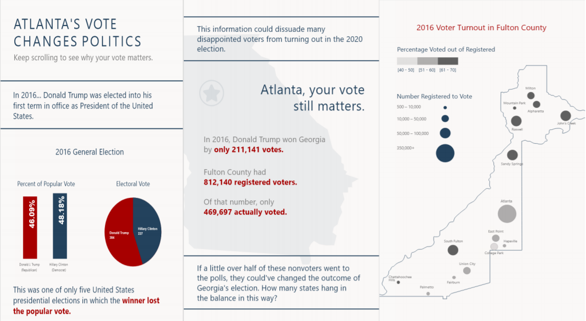
This project was created from a hypothetical prompt: “You have been asked by the City of Atlanta to provide an infographic essay that integrates data from different sources into a coherent whole. You will need to incorporate data from four different sources”. We started this project at the beginning of the 2020 election year. The talk of Donald Trump’s impeachment was still lingering, primaries were approaching and we were being reminded left and right to make sure we were registered to vote. With these precedents on our mind, we thought about how often we actually saw people in our city and on our college campus voting. The answer was not often. Politics are a pretty common topic in our realm but the truth is we don’t as regularly see people enacting their beliefs through voting. With that, we decided to look into the actuality of voter turnout in our city across different communities, ages, genders and ethnicities. We decided to look not only at how much of our population votes but also at our ability to make a difference. How much power do we actually have when we show up at the poles? We knew the 2016 election was a great place to start figuring that out.
DISCOVERY PHASE
ACCESSING BIAS
With data viz there is always going to be bias — we learned that in class. With a topic such as politics the bias is most likely going to be even stronger. With this in mind, we knew we couldn’t escape our beliefs. We decided to approach the project with honesty, but to never let our bias allow us to be misleading when displaying data. We want a different outcome than the 2016 election but we will check our bias at the door when it comes to the actual creation of visualizations.
NARROWING THE SCOPE
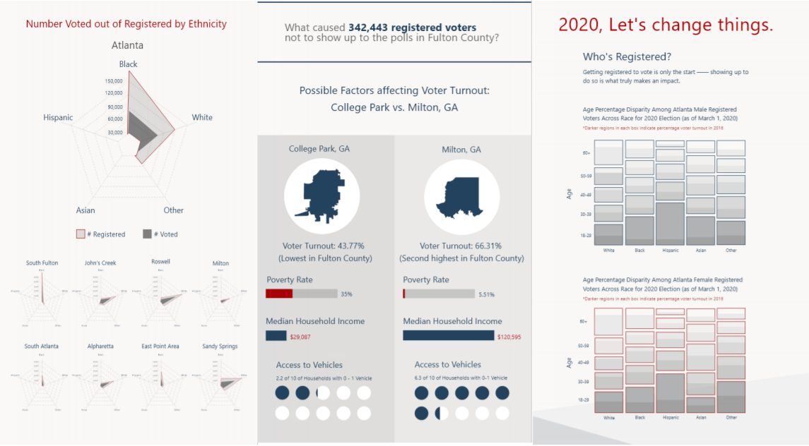
After our initial research and ideation, we decided it was time to tune our ideas to create more realistic parameters for our ongoing designs. Our solution was to only look at one election rather than 5. Narrowing our scope to the 2016 election gave us the capacity to dive more deeply into the topics we were really interested in. These included serious issues that exist in our own city such as racial inequality, the continuance of poverty cycles, voter suppression and unequal representation.
QUESTIONS TO ANSWER
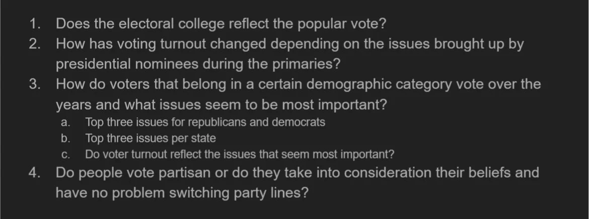
We came up with an initial set of questions that we wanted to ask while creating our infographic. In the beginning, these questions were definitely wide ranging. Though these were interesting topics to consider, as we researched we realized we would have to narrow our scope to keep it in the constraints of a one semester project.
LOCATING DATA
With a narrowed perspective, we dove into finding data that we could use in our visualizations. This was a more tedious process than we expected. Clear political data is harder to come by than one would assume. In the end, we located a combination of data that looked at registered vs voted numbers in each county and voting precinct in 2016. This data included ethnicity and gender demographics. We found data that looked at 2016 General Election(popular and electoral) results across all of the US. We also found data that looked at 2020 registered voter numbers and demographics.
Ga General Election Turnout by Demographic, Nov 2016: https://sos.ga.gov/index.php/elections/general_election_turnout_by_demographics_november_2016
Polling/Precinct Locations: http://fulcogis.maps.arcgis.com/apps/webappviewer/index.html?id=6962a9835ace43ea8326e25a5808c815
2016 Electoral and Popular Vote: https://uselectionatlas.org/RESULTS/
2016 General Election by County: https://data.world/garyhoov/2016-pres-election-by-county
2020 Registration Data: https://sos.ga.gov/index.php/Elections/voter_registration_statistics
Milton vs College Park Demographics: https://datausa.io/profile/geo/college-park-ga?compare=milton-ga#housing
DATA VISUALIZATIONS
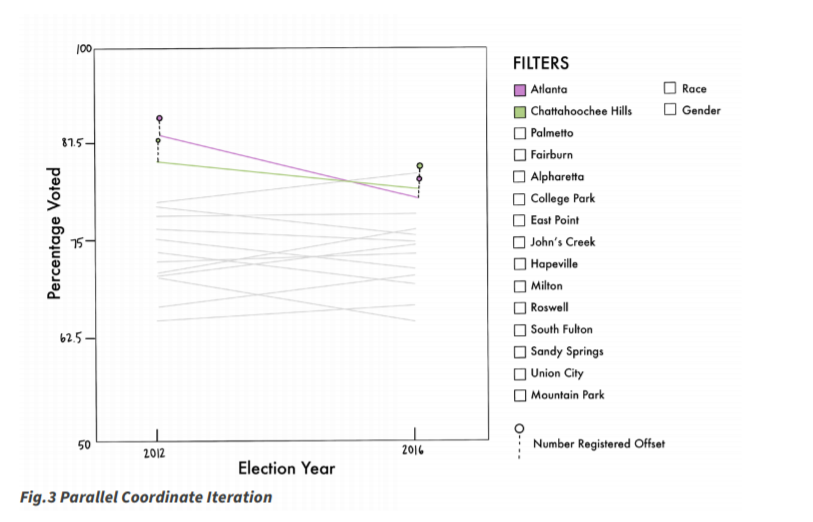
When creating our visualizations we wanted to be sure that each graph displayed our data from a different view point. With this in mind, we cycled through several iterations before we landed on our final designs. Below you can see each major visualization and the changes we made throughout the design process.
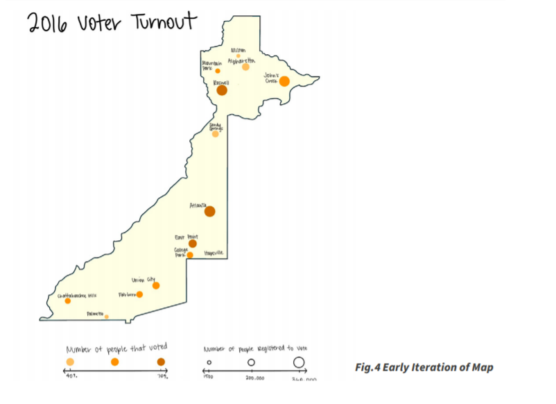
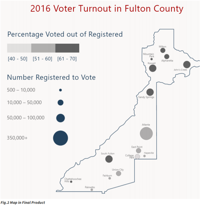
Visualization 1: Fulton County Map
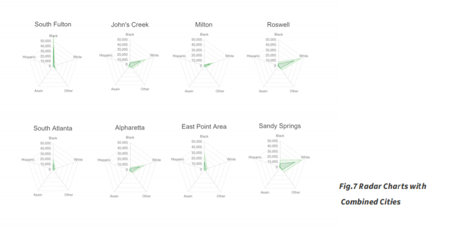
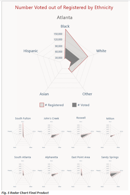
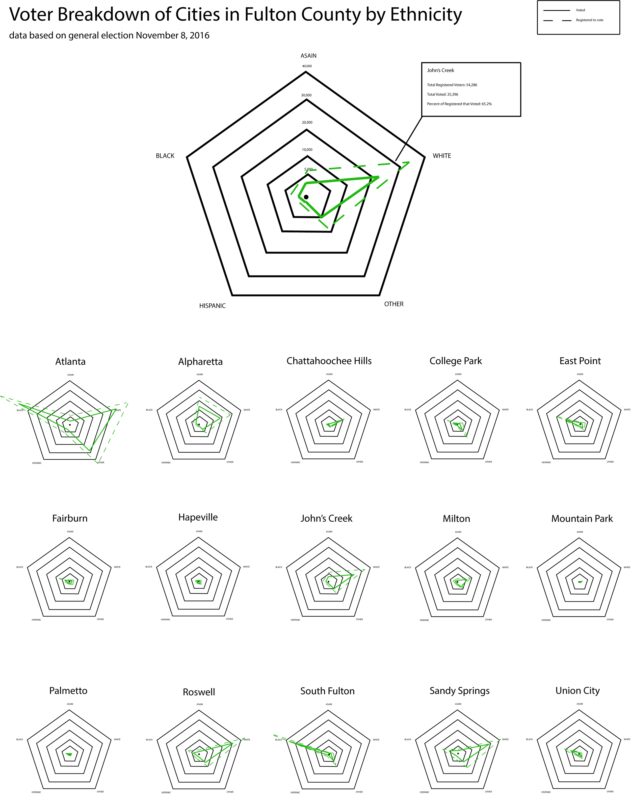
Visualization 2: Radar Charts
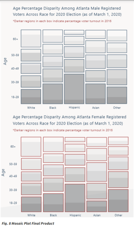
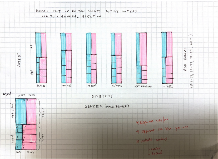
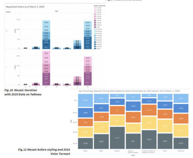
Visualization 3: Mosaic Plot
Final Layout
We knew from the start of the project that we were going to need to display a lot of information and a lot of detail in our visualizations. In the beginning of our process, we thought a sort of scrolling web site would be the best way to depict our information. After playing with this layout, we realized that we wanted users to have a bit more control over their viewport and their zoom capabilities. From there we decided to format our layout as an online infographic.
Our greatest challenge with the layout of this infographic was definitely finding a consistent feel throughout. As you can see in the iteration images of the process book, we struggled finding consistent font sizing, line weight, and columns. With fine tuning and constant iterations we were able to get to a product we are very happy with!